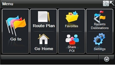
I've done some research on some Gps menus because for my navigation it will need a start menu to make it easier for the user to search. I was also planning to use symbols as well as words for each button/tab so it will be easy to read and understand.
This Gps menu here is simple and easy to understand because the tabs are at a reasonable size to be able to see and the symbols do describe the the name of the tabs.
This is another Gps menu, I think that the tabs are simple and nicely set out on the screen just like the Gps above. In my opinion I reckon some of the symbols on the tabs could be a bit better, like they will relate to the names of the tab more. For example the love heart for my places, I just don't think it symbolizes it very well.


No comments:
Post a Comment